MaxQuant finished running at some point during the night. You open proteinGroups.txt and immediately face to a large text document data with 220+ columns, most of which you have never seen before. Somewhere in there — buried under peptide counts, sequence coverage, and a dozen score metrics — are the LFQ intensity values you actually need.
I have been through this enough times that I built a pipeline to stop making the same decisions twice. This post walks through it: five stages, real code, one real dataset (the CLN3 lysosomal interactome, PXD031582). The design philosophy is simple — the only thing you should need to edit between experiments is the experiment design block. Everything else runs untouched.
What the pipeline does
Before diving in, here is the full picture:
- From file to data frame — clean MaxQuant output, fix zeros, remove contaminants
- Telling R what your experiment looks like — conditions, replicates, contrasts
- Normalisation and imputation — VSN + mixed MNAR/MAR strategy
- Finding what changed — limma/eBayes differential abundance, multiple testing correction
- Making the results visible — volcano plots, heatmaps, PCA
The entry point is an R Markdown document that sources each stage in order. It serves both as the analysis script and as a reproducible report you can hand to collaborators.
From file to data frame
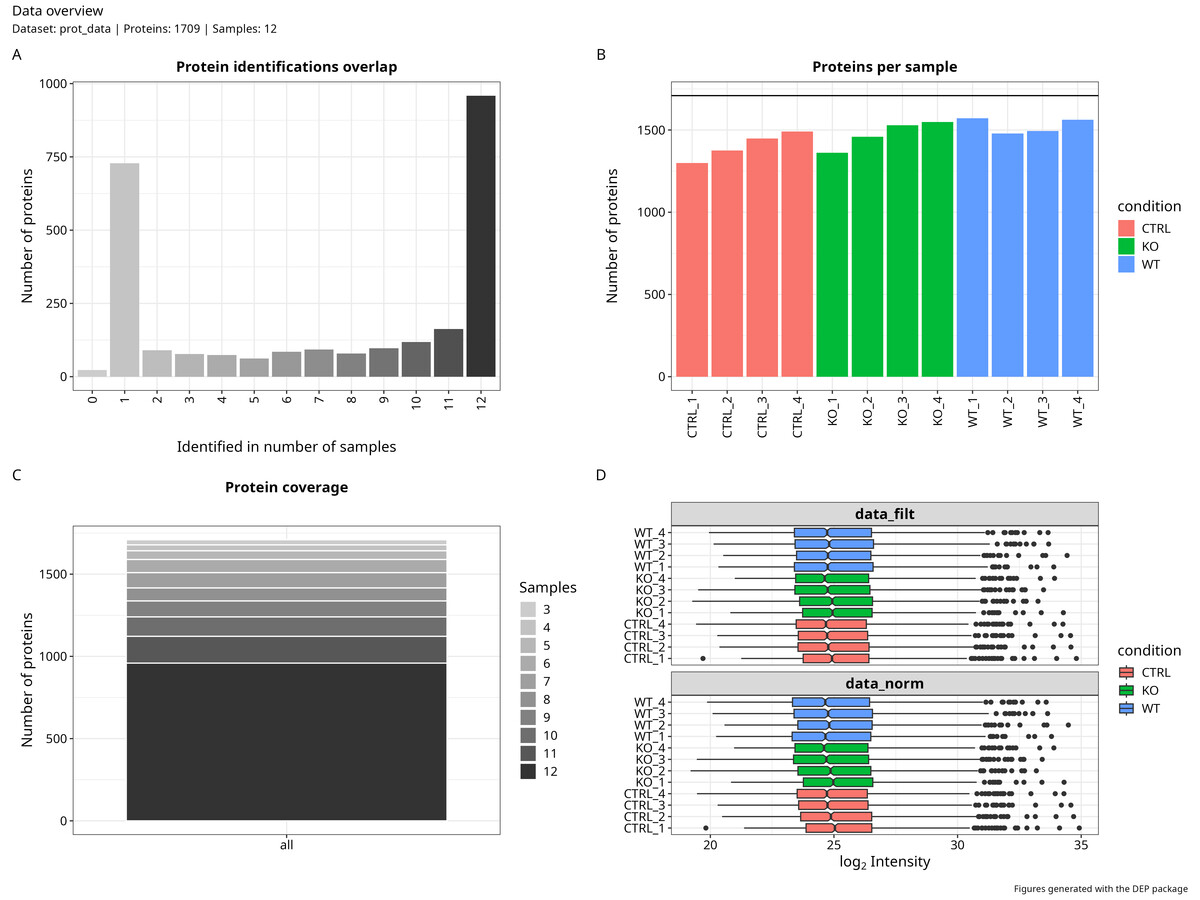
MaxQuant’s proteinGroups.txt has everything — more than you need, in a format that requires some untangling. The first thing I do is load it and immediately address something MaxQuant does not make obvious: it encodes missing LFQ intensities as zero, not NA.
This sounds like a small detail. It is not. If those zeros stay in, your normalisation, your imputation, and your variance estimates all treat them as real measurements of zero protein abundance — which they are not. Converting them to NA before anything else is the single most important step in the entire pipeline.
loading_data <- function(prot_data) {
  # MaxQuant encodes missing LFQ intensities as 0. Convert to NA immediately.
  prot_data[prot_data == 0] <- NA

  # Standardise column names across MaxQuant versions
  colnames(prot_data)[which(names(prot_data) == "Accession")]           <- "ID"
  colnames(prot_data)[which(names(prot_data) == "gene_names")]          <- "genename"
  colnames(prot_data)[which(names(prot_data) == "Protein Description")] <- "Description"

  # Remove known contaminants (labelled as such by MaxQuant)
  prot_data <- prot_data %>%
    filter(!str_detect(genename, "contaminant"))

  return(prot_data)
}

prot_data <- readxl::read_xlsx("rawdata/ProteinGroups_PXD031582.xlsx")
prot_data <- loading_data(prot_data)
The contaminant removal is easy to overlook, but it matters. MaxQuant flags common contaminants — keratin, trypsin, albumin — by prefixing their gene names. Leaving them in inflates your protein count and can distort normalisation, especially in smaller datasets.
Telling R what your experiment looks like
This is the only section of the pipeline I edit when working with a new dataset. It maps each sample’s MaxQuant column name to a condition and replicate, and defines the pairwise contrasts to test.
# Original MaxQuant column names (must match proteinGroups exactly)
label <- c(
  "LFQ intensity CTRL_01", "LFQ intensity CTRL_02",
  "LFQ intensity CTRL_03", "LFQ intensity CTRL_04",
  "LFQ intensity TMEM_CLN3_KO_01", "LFQ intensity TMEM_CLN3_KO_02",
  "LFQ intensity TMEM_CLN3_KO_03", "LFQ intensity TMEM_CLN3_KO_04",
  "LFQ intensity TMEM_CLN3_WT_01", "LFQ intensity TMEM_CLN3_WT_02",
  "LFQ intensity TMEM_CLN3_WT_03", "LFQ intensity TMEM_CLN3_WT_04"
)

# Short names used internally throughout the pipeline
columns_to_rename <- c(
  "CTRL_1", "CTRL_2", "CTRL_3", "CTRL_4",
  "KO_1",   "KO_2",   "KO_3",   "KO_4",
  "WT_1",   "WT_2",   "WT_3",   "WT_4"
)

condition <- as.factor(c(
  "CTRL", "CTRL", "CTRL", "CTRL",
  "KO",   "KO",   "KO",   "KO",
  "WT",   "WT",   "WT",   "WT"
))

replicate   <- rep(1:4, times = 3)
comparisons <- c("CTRL_vs_WT", "CTRL_vs_KO", "KO_vs_WT")

Exp_design <- cbind.data.frame(label, condition, replicate, columns_to_rename)
Isolating this block completely is what makes the pipeline reusable. Swap in new column names, new conditions, new contrasts — the rest of the code runs unchanged.
Normalisation and imputation
This stage applies VSN (Variance Stabilising Normalisation) to log-transformed LFQ intensities, then handles missing values through a mixed MNAR/MAR strategy. I covered the imputation logic in detail in the previous post — the short version is that not all missing values are missing for the same reason, and treating them as if they were leads to inflated false positives downstream.
data_cleaning(
  prot_data,
  Exp_design,
  comparisons,
  output_path,
  fraction_NA      = 0.6,   # proteins missing in ≥60% of replicates per condition → MNAR
  factor_SD_scale  = 0.3,   # spread of the truncated normal used for MNAR imputation
  factor_SD_impute = 0.05,  # shift below detection floor (multiples of global SD)
  mnar_var         = "zero" # MNAR method: "zero" = left-censored truncated normal
)
The function returns a SummarizedExperiment object with the imputed intensity matrix plus MNAR classification metadata per protein and condition. That metadata travels all the way to the final results table, so you always know which proteins were imputed as MNAR and in which conditions — useful context when you start interpreting hits.
A few parameters worth tuning for your specific experiment:
fraction_NA: with 3 replicates, 0.67 may be too strict; 0.5 is safer. With 4+ replicates, 0.6 is reasonable.factor_SD_impute: controls how far below the detection floor MNAR values land. 0.05–0.2 is typical; lower values sit closer to the observed minimum.mnar_var:"MinProb"and"QRILC"are valid alternatives;"zero"with a truncated normal is more explicit about what the imputed distribution actually looks like.
Finding what changed
With a complete intensity matrix, differential abundance analysis follows: protein-wise linear models with empirical Bayes moderation via limma, wrapped by DEP::analyze_dep(). The model uses a cell-means parameterisation (~0 + condition) so that contrasts map directly to biological comparisons without a reference-level artifact.
data_analysis(
  mixed_splited_imputation,
  Exp_design,
  comparisons,
  output_path,
  adjusted_method = "BH"
)
The function fits to Empyrical Bayesian model, tests each contrast, and exports a results table with log2 fold-changes, p-values, and significance calls per protein per comparison.
Which p-value should you actually trust?
This is where I see most proteomics pipelines quietly go wrong. The function computes three corrected values for each contrast, and they are not equivalent:
-
BH adjusted p-value (
p.adj): Benjamini-Hochberg FDR correction. Conservative by design — it assumes all tested proteins are null (π₀ = 1), which is never true in a real experiment. It systematically under-reports discoveries. It is the field standard and what you report for publication, but it should not be your only tool for exploration. -
Storey q-value (
q.val): also FDR-controlling, but it estimates π₀ from your data rather than fixing it at 1. In practice this makes it more powerful and more honest. The q-value for a protein means: if I draw the significance threshold here, the expected proportion of false positives among everything I call significant is q. This is the criterion I use for prioritising candidates. -
DEP’s internal fdrtool adjustment: I would not use this as a primary criterion. DEP’s
fdrtooloperates on eBayes-moderated t-statistics, and the eBayes shrinkage compresses those statistics toward zero.fdrtoolmisreads this compression as evidence that most proteins are null, overestimates π₀, and produces corrections that are pathologically conservative. You will lose real hits — not because they are not there, but because of an artifact in the method combination.
The fastest diagnostic is to plot the p-value distribution for each contrast:
pval_data <- data_results %>%
  select(matches("_p\\.val$")) %>%
  pivot_longer(everything(), names_to = "comparison", values_to = "p_value") %>%
  mutate(comparison = str_replace(comparison, "_p\\.val$", ""))

ggplot(pval_data, aes(x = p_value)) +
  geom_histogram(bins = 100, fill = "steelblue", color = "black") +
  facet_wrap(~comparison, scales = "free_y") +
  theme_minimal() +
  labs(title = "P-value distribution by contrast",
       x = "P-value", y = "Frequency")
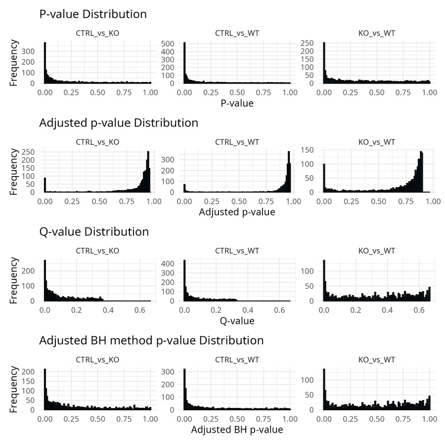
A well-behaved distribution has a flat uniform component from null proteins and an enrichment near zero from true signals. If you see enrichment near 1, your model is likely misspecified — revisit the contrast definition and check the imputation output. A completely flat distribution with no enrichment near zero means no detectable signal; that is worth investigating before drawing biological conclusions.
Making the results visible
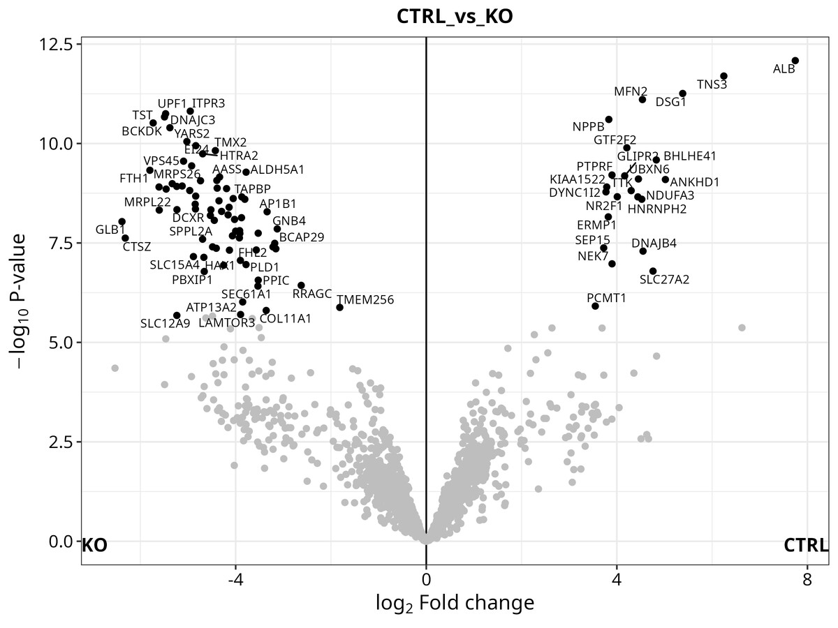
The pipeline generates three figures automatically:
Volcano plot — log2 fold-change vs. −log10(q-value), with significant proteins highlighted and labelled by gene name. A quick visual check on whether your contrasts are detecting anything meaningful.
Heatmap — ComplexHeatmap clustering of significant proteins across all samples. I find this the most informative figure for understanding whether the DE proteins actually separate your conditions, or whether significance is driven by one outlier sample.
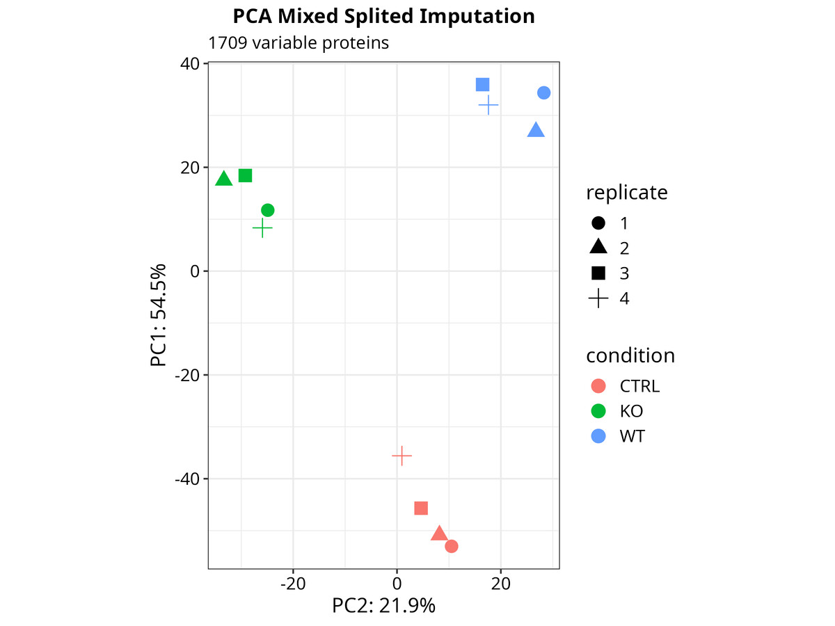
PCA — sample-level principal components. Worth looking at before you commit to any interpretation — it will tell you immediately if something went wrong in sample preparation or if one replicate is behaving differently from the others.
# PCA from the DEP SummarizedExperiment object
p_pca <- plot_pca(dep_analysis, x = 1, y = 2,
                  n = ncol(dep_analysis), point_size = 4)

# Heatmap of significant proteins
p_heat <- plot_heatmap(dep_analysis, type = "centered",
                       kmeans = TRUE, k = 6,
                       show_row_names = FALSE, indicate = c("condition"))
All figures are exported in TIFF (for publication) and PDF (for vector editing).
Putting it all together
Once the functions are in place, the full analysis runs in five calls:
# 1. Load and clean
prot_data <- readxl::read_xlsx("rawdata/ProteinGroups.xlsx")
loading_data(prot_data)

# 2. Define the experiment (the only section you edit per dataset)
# ... (Exp_design block above)

# 3. Normalise and impute
data_cleaning(prot_data, Exp_design, comparisons, output_path,
              fraction_NA = 0.6, factor_SD_scale = 0.3,
              factor_SD_impute = 0.05, mnar_var = "zero")

# 4. Test for differential abundance
data_analysis(mixed_splited_imputation, Exp_design, comparisons,
              output_path, adjusted_method = "BH")

# 5. Visualise
source("code/05_Plots.R")
From a MaxQuant output file to a full results table with volcano plots, heatmap, and PCA. Besides the experiment design block, you can run this pipeline end-to-end without changing a single line of code. The functions are modular and reusable, so you can swap in a new dataset with a different design and it will run without any rewiring. Finally, Gene Ontology enrichment analysis together STRING network visualisation are available as optional add-ons if you want to explore the biology of your hits without leaving R. In this case, just run last chunks related to GO, GSEA, KEGG, and STRING after the main pipeline finishes.
A few things I have learned along the way
Match-between-runs matters. The pipeline assumes MBR is enabled in MaxQuant. If you disable it, your missing value rate goes up significantly and the MNAR fraction increases. Adjust fraction_NA accordingly, or reconsider whether disabling MBR was the right call.
Three replicates is a floor, not a comfort. The pipeline works with n=3, but eBayes moderation — the main reason to use this approach over a plain t-test — performs better with 4+. With 3 replicates, variance estimates are noisy and eBayes is compensating more than it should. Interpret results conservatively.
The SummarizedExperiment object is DEP-specific. If you are adapting this to a non-DEP workflow, you will need to extract the imputed matrix manually. The MNAR metadata stored in metadata(mixed_splited_imputation)$proteins_MNAR is custom and will not transfer automatically.
Lock your environment. The pipeline uses renv for package management — renv::restore() at project root reproduces the full R environment. One practical note: DEP 1.32.0 requires R ≤ 4.5.x. It was removed from Bioconductor 3.23 and its C dependencies break on R 4.6.0. If you are on a newer R, use rig or conda to maintain a 4.5.x environment for this project. This will be updated in the near future.
Closing thoughts
The goal with a modular pipeline is not elegance for its own sake. It is to separate the parts that change (the experiment design) from the parts that should not (the cleaning, analysis, and visualisation logic). Once those are decoupled, a new dataset is an afternoon of work rather than a week of rewiring.
The full pipeline and the PXD031582 dataset are available in the Proteomics repository.
DEP package documentation: https://bioconductor.org/packages/release/bioc/html/DEP.html
Xiaofei Zhang, Arne H. Smits, Gabrielle B.A. van Tilburg, Huib Ovaa, Wolfgang Huber and Michiel Vermeulen. Proteome-wide identification of ubiquitin interactions using UbIA-MS. Nature Protocols (2018). ————————————————————————
About the author: Santiago López Begines is a PhD-trained neuroscientist and data scientist specialising in omics data pipelines, biomarker discovery, and quantitative proteomics. For scientific collaborations or methodological exchanges, get in touch.